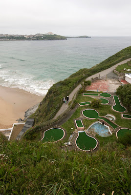
Project 16 is the introduction to part 3: Elements of design of my photography course "art of photography".
The project asks for a list of ideas on points and how to photograph them. I came up with a few ideas for points, they were following:
- Clouds, small isolated clouds against a blue sky.
- Colourful ripe fruits still on the tree.
- Small bright flowers against grass or sand or even mud if lucky. Ideally framed from above a 45 degrees angle
- Animals, small ones or big framed at a distance.
- People at a distance.
- Isolated cars at a distance.
- Weird shapely trees at a distance.
- Rocks showing above the water.
- Any isolated thing at a distance.
- Decoration items on their plain(ish) environment.
- Insects on a contrasty background.
- Isolated lights at night.
- The moon against a black of cloudy sky.
- The stars against an empty sky.
- The sun framed through a high neutral density filter.
- The eyes of a person in a high key photo, or a controlled lighting set to make them stand out.
The course asks for a few examples of photos collected from magazines illustrating points, but for copyright reasons I'm left with no choice but to skip this task as I'm working online.
Here are some photographs taken from my own library that show points:


