Hi .
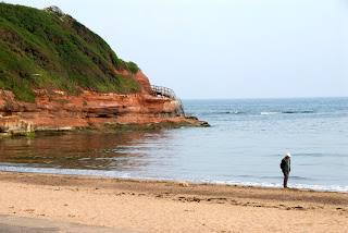
The project 14 is an exercise of composition and the difference in between composing photographs in landscape and portrait orientation, the exercise was simple and i was asked to shot 40 frames in total: 20 in landscape mode and 20 in portrait mode. I shot the same subject in pairs, one frame landscape and another in portrait. we should see the real difference in terms of suitability, aesthetics and the degree of difficulty in between both modes.
What i found out is that it is more difficult to shot portrait than landscape both handheld and with the tripod as the adjusting time is longer and it is somehow more difficult to align lines in the frame also it strains the wrists, arms, neck and eyes. the tripod also takes longer to set up and adjust, with longer lens the images are softer as it is less stable that in landscape mode. the camera displays are also difficult to read and the settings need to be operated intuitively, not by reading. Portrait mode is most suitable for subjects high in size and to shot scenes where the foreground point of interest is close to the photographer or at a certain vertical distance from the main subject, if the frame is to be composed of only one subject or point of interest it is then best for it to be positioned on the lower part of the frame just below the centre but in that case the subject needs to overpower everything else as it will have to be occupy a considerable chunk of space in the frame to be balanced. I also verified that the positioning of the horizon line is critical and most problematic if there is no foreground of interest. The elements in a portrait mode frame need to be vertically close enough to be photographed if the frame is to be balanced otherwise the frame should be photographed in landscape mode, which is more suitable to shot things in general as gravity allows things to be positioned to the sides and not so much on top of each other.
Landscape mode is not very suitable to photograph people as they are of a considerable height relatively to the distance between them and the camera which needs to be close otherwise the person is going to look very small in the frame. Landscape is often not suitable to isolate the subject at hand in the frame if the subject is high, but otherwise it is ok.
------------------------------------------------------------------------------------------------------------------------------------
Witches at work, no rest for the wicked.
------------------------------------------------------------------------------------------------------------------------------------
------------------------------------------------------------------------------------------------------------------------------------
------------------------------------------------------------------------------------------------------------------------------------
------------------------------------------------------------------------------------------------------------------------------------
------------------------------------------------------------------------------------------------------------------------------------
------------------------------------------------------------------------------------------------------------------------------------
------------------------------------------------------------------------------------------------------------------------------------
------------------------------------------------------------------------------------------------------------------------------------
------------------------------------------------------------------------------------------------------------------------------------
------------------------------------------------------------------------------------------------------------------------------------
------------------------------------------------------------------------------------------------------------------------------------
------------------------------------------------------------------------------------------------------------------------------------
------------------------------------------------------------------------------------------------------------------------------------
------------------------------------------------------------------------------------------------------------------------------------
------------------------------------------------------------------------------------------------------------------------------------
------------------------------------------------------------------------------------------------------------------------------------

------------------------------------------------------------------------------------------------------------------------------------
------------------------------------------------------------------------------------------------------------------------------------
------------------------------------------------------------------------------------------------------------------------------------


